


About 8 months after Mr. Cubbie and I started dating (and 3 months after moving in together!) we took a trip to France. This was a big deal to me. I [nearly] double majored in French in college (it was either the last semester of 2 French classes or a semester doing astronomy research in Chile), yet had never had the opportunity to go to France! They don't really offer science classes in study-abroad programs in Europe.
Finally in France, we spent a week at a gîte in the Drôme region, just north of Provence (a cute little cottage!). We went for runs every day through the countryside to town (not a bad way to pick up your produce!). By "countryside", I mean something like this:
Thinking back on the first few months of our engagement, I'm surprised it took me so long to figure out our wedding colors. They were so obviously waiting for me in France!
I'm not kidding when I say I love France - Mr. Cubbie and I have a back-burner plan to move there (it's our "5-year plan").
Even if a move to France proves difficult, we'll likely end up recreating our own little France in Oregon. Mr. Bear Cub wants to build a cobblestone house for us (like in the picture above)! I can't wait to have our pet goats - that means fresh chèvre!
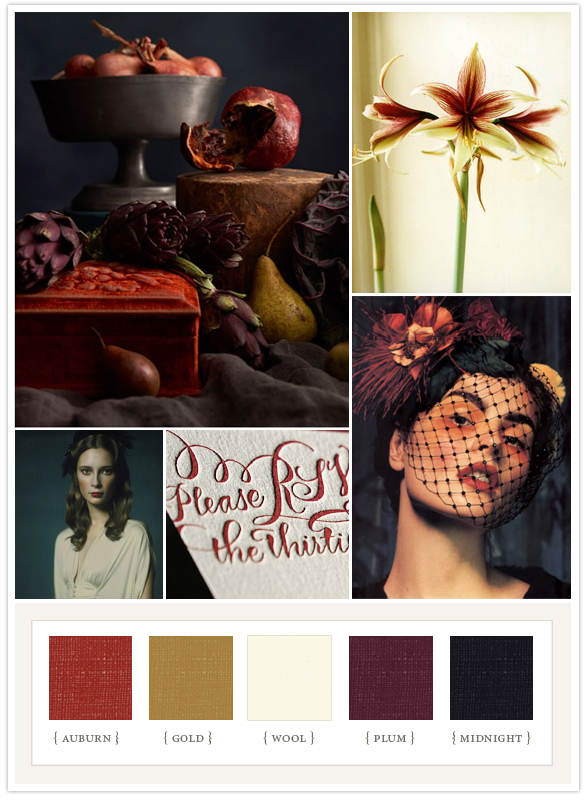
Once I realized my color inspiration was so starkly obvious, I decided I needed to expand on the color palette a bit. Red and purple aren't so tantalizing when described as such. Our wedding is in September, so we needed to go for something a little more subdued and muted. Something a little more... impressionist?
Meet Claude Monet, France's 1880s version of Martha Stewart (weddings edition). This man really had a thing for flower arrangements!
He's also quoted as saying that he loved to garden so it would "give him something to paint on rainy days" (see photo source). Rainy days! Flower arrangements! Painting! How much more inspiration could one ask for?
Mr. Monet also had a thing for fields of poppies (red, of course! this was France!).
And also individual poppies - but this time lavender! (too much of a mélange? ;) )
With the mindset of toned-down hues of lavender flowers and red poppies, I did a google image search for just that.
Look what "popped" up! Perfect!
That's no where near to just red and purple. There's depth to the color - a real spectrum to play with when planning the details!
I also needed to keep in mind the fact that we weren't getting married in France (where colors like those above are abundant) - we were getting married on the Oregon coast.
I think it's crucial to consider your location when thinking about your wedding colors. Neons wouldn't look so fantastic in the forest, for example. All of this - the season, the location, the lavender and poppy fields - can work together to create an inspirational color palette for a wedding. As with the impressionist paintings, I just have to keep in mind to keep things dreamy and wistful.
I can do wistful (especially on the Oregon coast!). I love this photo (above) of a couple taking a walk on a coastal farmland after their wedding. That's exactly the mood I want to evoke.
That's another thing to think about when planning your colors - the mood. While definitely hot colors, the popular teal and poppy color palette would be hard (in my opinion) to pull off for a wedding on the coast (like above) or in the forest (like below), let alone a wedding on the coast and in the forest (like mine!).
I want my guests to feel at ease dining with the trees under the stars!
Major bonus - organic tomatoes totally match the poppy color scheme ;).
Ok let's bring this altogether now (with a little help from snippet & ink and 100 layer cake).
Easy-going, carefree wedding by the water - check.
Deep hues inspired by the season - check.
(Include seasonal foods by exploiting pears? CHECK!)
Lavender and poppies, with a dash of the oregon coast, and toned down for the fall season?
love. it.


LAVENDER. Fields and fields of lavender. Fragrant, pungent, seductive lavender. And in several fields, nestled atop the lavender was perky little blossoms of red poppies.

Thinking back on the first few months of our engagement, I'm surprised it took me so long to figure out our wedding colors. They were so obviously waiting for me in France!
I'm not kidding when I say I love France - Mr. Cubbie and I have a back-burner plan to move there (it's our "5-year plan").

Even if a move to France proves difficult, we'll likely end up recreating our own little France in Oregon. Mr. Bear Cub wants to build a cobblestone house for us (like in the picture above)! I can't wait to have our pet goats - that means fresh chèvre!
Once I realized my color inspiration was so starkly obvious, I decided I needed to expand on the color palette a bit. Red and purple aren't so tantalizing when described as such. Our wedding is in September, so we needed to go for something a little more subdued and muted. Something a little more... impressionist?
Meet Claude Monet, France's 1880s version of Martha Stewart (weddings edition). This man really had a thing for flower arrangements!

He's also quoted as saying that he loved to garden so it would "give him something to paint on rainy days" (see photo source). Rainy days! Flower arrangements! Painting! How much more inspiration could one ask for?
Mr. Monet also had a thing for fields of poppies (red, of course! this was France!).

And also individual poppies - but this time lavender! (too much of a mélange? ;) )

With the mindset of toned-down hues of lavender flowers and red poppies, I did a google image search for just that.
Look what "popped" up! Perfect!

That's no where near to just red and purple. There's depth to the color - a real spectrum to play with when planning the details!
I also needed to keep in mind the fact that we weren't getting married in France (where colors like those above are abundant) - we were getting married on the Oregon coast.

I think it's crucial to consider your location when thinking about your wedding colors. Neons wouldn't look so fantastic in the forest, for example. All of this - the season, the location, the lavender and poppy fields - can work together to create an inspirational color palette for a wedding. As with the impressionist paintings, I just have to keep in mind to keep things dreamy and wistful.

I can do wistful (especially on the Oregon coast!). I love this photo (above) of a couple taking a walk on a coastal farmland after their wedding. That's exactly the mood I want to evoke.
That's another thing to think about when planning your colors - the mood. While definitely hot colors, the popular teal and poppy color palette would be hard (in my opinion) to pull off for a wedding on the coast (like above) or in the forest (like below), let alone a wedding on the coast and in the forest (like mine!).
I want my guests to feel at ease dining with the trees under the stars!

Major bonus - organic tomatoes totally match the poppy color scheme ;).

Ok let's bring this altogether now (with a little help from snippet & ink and 100 layer cake).
Easy-going, carefree wedding by the water - check.

Deep hues inspired by the season - check.
(Include seasonal foods by exploiting pears? CHECK!)

Lavender and poppies, with a dash of the oregon coast, and toned down for the fall season?
love. it.
Where did you get your inspiration for wedding colors from?

My inspiration began with my favorite colors: green & brown. They're my favorites for a variety of reasons. They look lovely with my complexion and hair color. They remind me of tromping through the woods as a youngin' (and now as well.. but then I'm still 19, so still a youngin'?). The ideas expanded when we began looking for venues. All of the places I loved featured towering trees and the earthy tones of my palette, with the subdued autumn hues we have in Texas. Nature in the form of leaves and other natural elements became infused with my "theme" very quickly.
ReplyDelete